Monday, November 29, 2010

Color Transforms


Le Pegase de Hermes By Christian Renonciat

Color is what makes the world interesting and allows for individuality. As seen on these Hermes scarves, one has a wide array of color on it and the other is simply a sketch on a white background. The first scarf has lots of juxtaposing color, which draws the eye in and really makes it look at what is happening in the art. While the plain white one is really rather boring and doesn’t grab one’s attention at all. Color is key in making a good design, and without the correct use of it a design could go completely wrong. This scarf is perfect example of good color use because it really plays with juxtaposing color and quantity and yet it stays contained to Pegasus and doesn’t overcrowd the entire silk square. The brilliant colors used here really show what a beautiful piece of art the scarf is and the design is made into something incredible. While the white scarf is terribly bland and boring, the black sketch lines overcrowd the white and make the whole square look cluttered and uninteresting. This is a perfect example of how color really transforms a design. They are the exact same thing just one has an array of beautiful colors strategically placed that catch the buyers attention and the other completely makes the scarf look bland and standard. Color makes everything unique and the color scarf in this example becomes a totally different piece of art because of it’s brilliance.

Dangerous Design


Firearms

The invention and design of firearms has really made the world into a much more dangerous and unwelcoming. Guns are such fatal weapons, and yet they are available to the public to own and keep. Firearms fuel wars and hate amongst everyone with the dangerous affect it has on it's victims. A gun is designed to hold multiple bullets at once so when the handler pulls the trigger multiple times, all the bullets come out. To create an object that is able to hold and fire multiple fatal objects at once is a hazard to everyone who ever comes in contact with it. Handguns are designed specifically to be easily concealed and used at a moment’s notice, which makes them available to anyone really. Despite being small and concealable, handguns are still lethal weapons that can take another being’s life. The idea that guns are designed and made with the intent to kill something makes them such unethical objects. Firearms are such powerful weapons and yet are accessible to anyone. Without guns, there wouldn’t be cartel wars going on in Mexico right now, genocide happening all over the world, and really any source of violence happening in the world right now. Guns are what give bad people in society power to control and get what they want. Firearms create fear in the world because of the instant death they provide if used correctly. The fact that firearms are being updated in their design all the time to create more powerful machines is frightening. With the arrival of new and improved machine guns and more advanced artillery, society will become much more unstable and fearing, causing the world to degrade.

Utopian Design


Personal Computers

The availability of computers in our society has allowed for individuals to explore everything the world has to offer, share their creativity, and become connected with the global community. The first computers were limited to small numbers of people and not available to the world yet. With the dawn of personal computers, everyone can have access to the web and communicate half way across the globe with each other. The way this has been made possible was through the redesign of computers. Desktop and laptop computers are convenient for any person because of their design. The first computers took up whole rooms with all of their inter workings, but with time that has been compacted into such a way that is practical and accessible. Computers have evolved into staples in our society and we really could not live without them anymore. The access that they allow is unbelievable, and without them our class couldn’t all be writing blogs, or one couldn’t find rare music from Turkey at the click of a button. The world is at our fingertips because of the personal computer and that has made the world a more connected place, working towards a better society. Personal computers have allowed the individual to stand out in any aspect and that really goes to show its power. Without computers the world would be a much more narrow minded and selfish place that fostered no expression of individuality. The small personal computer has transformed everything we look at and how society functions.

Monday, November 15, 2010

Check it out

The music video for Will.I.Am and Niki Minaj’s new song Check It Out really uses words and images in conjunction. The whole video really plays with design concepts and abstraction. The video begins with an announcer who introduces the song in a very Japanese game show way to a military-esque audience. The audience is all in the same black outfit and have sunglasses on, they all move at the exact same time and express no emotion. Then Will.I.Am and Niki Minaj come on and they are in these bright futuristic outfits that really contrast the dark audience and while they are singing bright Korean words pop on to the screen. The two singers really embodied the whole robotic aesthetic with both their singing voices not sounding like real ones and the way their bodies moved on the stage. Despite the singers robotic ways, the audience too were very robotic, almost more so than the singers because there was no color or movement from them. The whole idea of the words popping out was interesting because as only and English speaker, I couldn’t read what they were saying, but I understood the lyrics being sung, but to a Korean speaking person they couldn’t understand the singing, just the popping words. This really made the video very global in the sense that it crossed cultures with both the words and images in the video. The mixed medium had a strong affect on the video because the words emphasized certain points in the song, even if some couldn’t understand either the lyrics or the popping words.


Ergonomics of a Cheese Knife

Culinar Soft Cheese Knife

Cutlery has always needed to be ergonomically designed so that the user may successfully cut items without harming themselves. Knifes are very sharp, dangerous pieces of kitchenware that are used daily to prepare food all over the world. If they were not designed properly there would be injuries constantly happening, and most people would probably loose a few fingers. Knifes are so important to everyday life, and the way we eat food today that they must be safe, comfortable, easy to use, have high performance and look aesthetically pleasing. This soft cheese knife by Wüsthof really embodies all of those ergonomic qualities and more.

Safety is key in cutlery design because of the danger they inherently possess. A sharp blade being thrust down into something is quite hazardous especially when the user’s fingers are centimeters away from it. This soft cheese knife’s handle is designed to fit perfectly into one’s hand with a natural grip. This allows for less slippage on the handle and a more secure grip.

The comfort of the knife goes hand in hand with the safety of the device. The handle once again is key to the comfort of the knife because of its natural shape and grip. The smooth steel that the knife is made out of makes for very cool and comfortable handling.

This soft cheese knife is specifically made to only cut through cheeses like Brie, Camembert, or Roquefort. Since it has a specific use, the ease of use is quite good. The holes that are placed throughout the blade help achieve that ease of use by preventing the cheese from sticking to the knife. The holes provide a smoother cut and a clean slice making the item much easier to use than others.

The performance of this knife is very high because it’s quality. It is made from the German company Wüsthof who is known for their exceptional quality and strength. The knife itself is made from a solid piece of stainless steel, which makes it very strong, and the blade stays sharp for a very long time.

Lastly the aesthetics of this knife are very beautiful for a piece of kitchenware. It is made of solid stainless steel, so the whole knife is a solid silver color, and since it is all one piece it really looks like it flows. The handle and blade are not stuck together, but rather flow into each other and it looks like an art piece. The holes in the blade that make the cheese not stick, really add a rather whimsical feature to the knife and separate it from the rest of a knife set. It has a swooping blade that swings up at the end and really adds to the curve of the whole knife.

The Wüsthof soft cheese knife really embodies the concept of ergonomic designs because it fulfills all of the components that make an item user friendly. Not only does this knife look much more beautiful than most others, but it provides much more for it’s user and the world that uses it.


Monday, November 8, 2010

Klaus Nomi


Klaus Nomi, the musician-artist who was spawned from the 80's counterculture in New York City. He was a German countertenor who had a passion for opera and new wave music. He was like an alien, and maintained that persona throughout his career as a performer. He inspired the likes of David Bowie and Jean-Michel Basquiat to work with him because of his amazing blend of opera and pop. He really is an artist who held design as a conversation in his work. He created a signature tuxedo costume that was a larger than life that he wore to all of his performances. He created music that was more than just music, but a vaudeville performance and really made others around him question it. He caused there to be a stir in the music and art world with his strange ingenuity and thus created a conversation surrounding it. His performances were pieces of design within themselves, with replicas of planets and creating an image of Nomi actually being an alien from outer space. To really push the boundaries of that scene in the 80’s allowed his work to be recognized and make his audience question what his art was about. He challenged his fans to really think about what he as a person was and what his strange hybrid music was too. He is a perfect example of having design as a conversation because of his interaction with his audience as more of a challenge to them to understand what was going on, rather than telling them directly.

Brian Fies use of Words & Images


Brian Fies came as a guest lecturer to our Design 001 class this past week and really discussed his creative process and all that went into creating his graphic novels. He really focuses in on the relation between words and images, and how that really defines what comics are. “The combo of words + pictures that add up to something.” As a comic artist he has to understand the way words and pictures add up to something, and he must know what that something is. Fies states that “comics transcend words and drawing” but they are something that works with space and time while uses symbolism and metaphors within both the words and images both. He enjoys using both words and images together because it allows for multiple ways of speaking to the reader. He can incorporate metaphors and symbolism into the words that his characters speak, or that the narrator speaks. With his work on Mom’s Cancer he was able to tell the story of his mother’s struggle with cancer as both an abstraction and as a clear description of all the emotions that were being felt at that time. Without incorporating both words and images in this novel, he couldn’t have gotten his point across as he had wanted to. Fies is able to communicate many emotions and situations with the combination of words and images which he wouldn’t have been able to do without if he was only working with one of those components.

Shepard Fairey's use of words & images


Shepard Fairey, has exploded into pop culture in these past couple of years due to art prints of President Obama being popularized in the 2008 presidential elections. Fairey had been around for many years before this creating many iconic pieces like his Andre the Giant “Obey” but he really was thrown into the public eye with the Obama posters. He incorporated a powerful word under a very patriotic image of Obama, and this became the poster of the whole campaign. Without the powerful “Hope” or “Change” underneath this image it wouldn’t have made such an impact on the imagery of the election. The single word really makes the viewer see nothing other than what is stated in bold beneath the image. This use of word and image is very powerful and sort of hypnotizes the viewer into only thinking this word when you look at the image of this patriotic and powerful man. The blue hues in the image are very cool and force the viewer to feel confident and calm while staring at Obama, it seems to really embody the word that is stated in it. I thought this was such an interesting use of word and image because of the power of it and how extremely popular it became a couple years ago, and because of it’s power people are still trying to use this word and image compilation today to motivate and move their viewers.

Monday, November 1, 2010

OBJECTIFIED


The film Objectified really focuses in on the interaction between content and form, and how they are really united. It honed in on many talented industrial designers and how they approach the art that they are creating. Being a contemporary industrial designer you must keep form and content in mind, rather than just the content of an object. The designers featured in this film really embodied this theory that the every day objects we use must also be visually pleasing rather than as rough as possible. Designers must focus in on how they can make something that functional, beautiful. One of the designers featured in this film was the head designer of Apple, and they are truly one of the most stylized mainstream items we have in our culture today. Apple products are so smooth and simple, that one automatically knows that it’s a Mac when you see it. The designer said that it is Apple’s goal to make the item look completely different than what it really is and disguise it in a beautiful piece of design. He said that if we didn’t know that the iPhone was meant to be a cellular phone, we wouldn’t know what to do with that smooth rectangular piece of aluminum and glass. This really embodies the concepts used in industrial design today and it allows form to be much more connected with the content of an item.

Izze Bottle


I came across this Izze bottle while searching for an inspiringly well-designed object, and I think it really falls under that heading. The bottom of this bottle serves as a bottle opener for another bottle of Izze! The designer really created something that was unexpectedly useful, out of something that normally is left alone: the bottom of a bottle. This bottle’s concept is very interactive with both form and content by having it look and function like a normal bottle, but also have this additional add on of a bottle opener. The designer had to incorporate an opener into the bottle and that really allowed for it to stand out. Not only does the bottom of the bottle look similar to other bottle bottoms, but also it actually looks quite a bit more stylized with the opener. The designer really worked with their audience and added something that would really benefit them and possibly change the shape of bottles forever. By working with the idea of gestalt, the designer unified something very classic, the bottle, with something new and creative, the opener at the bottom of it. This is such a small piece of design, but I think it really symbolizes the progress of design and how designers are constantly modifying old designs.


Image taken from: http://www.stumbleupon.com/su/81Dkjt/dandelion.idasia.org/2007/11/20/redchiew-do-the-twist/

The Nudie Suit

The Nudie suit was an item of clothing most desirable to the country stars of the past. Nudie Cohn was a tailor who started detailing rodeo suits and selling them to country stars like Porter Waggoner and Tex Williams, and they became the symbol of the country culture. The detail that was put into these suits is unbelievable, from rhinestone covered wagons on them to music notes down the sleeve. Nudie really made the Nashville style with those suits as they became more and more popular. Despite Nudie being a tailor by trade, he really was a designer who created an iconic style. The concept of putting embroidery on a nice suit must have been unheard of, but he wanted to focus in on the form of a suit, more than just its content. He changed the way people in the Grand Ole Opry dressed forever and revolutionized the style of Nashville. He made Gram Parson’s suit (pictured above) and it had marijuana leaves and poppies embroidered all over it and Elvis Presley’s famous gold lame suit (pictured below). Nudie really was an amazing designer and his attention to detail was phenomenal. There still has been nothing quite like a Nudie suit that has influenced a culture such as he has.

Monday, October 18, 2010

Bollywood Style


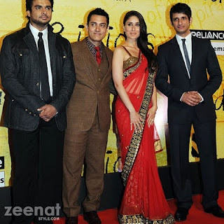
Bollywood is the largest film industry in the world and by far the most popular, with its country of origin being the second largest in the world, India. Everything about a Bollywood film is stylized and made to look super glamorous because that is what people in general want to watch. Each film has a heroine who dresses perfectly with the most beautiful saris one could ever imagine, with perfectly curled hair and flawless makeup. These heroines are not only are they superstars, but they are the face of fashion in India. The trends are all based off of these celebrities who really don’t know anything about fashion, they just wear what they are provided. The saris and salwar kamezes that sell for the most are the ones that are duplicates of what was in the latest film. To think that just a few people have power over style in a nation is so interesting because it not only shows the power of celebrity, but it also shows the power of fashion. The clothing they are wearing in a sense makes them into the megastars that they are. By creating something that every woman in India can feasibly possess and selling it really shows the power of popular culture and how much fashion is apart of that.

Comparison & Contrast


The old logo(left) vs. The new logo (right)

Gap came out with a brand new logo last week, expecting applause from the world and instead got hit hard with criticism. This backlash came from the general public via social network sites like twitter and facebook along with scorn from professionals. The new logo had sans-serif typeface, which was bolded, on a plain white background, and there was a gradient blue box just above the “p” in “Gap”. This new logo really retrograded the whole company’s look through its simplicity and overall bulkiness. There is no real style in this logo and it seems very generic, not setting the Gap apart from say a pharmaceutical company. It seems as though the designers were really trying to emulate the famous American Apparel logo, where its just bold Helvetica font spelling out the name, but they failed to capture that and instead captured something that was just plain boring. The logo that Gap has been using for 20 years or more is a simple navy block with long, skinny serif letters spelling out “Gap”. This logo really fits the Gap and the whole style of the store, with their plain and simple clothes that have very stylish cuts and modern trends. The general public obviously really felt strongly about this old logo and was deeply offended by the new logo. People were not afraid to voice their opinion on the change in icons, and so as a result there was a huge outcry. The Gap responded to this by immediately revoking the newly designed logo and keeping the age old classic one. This is really a perfect example of how minor differences in a logo can really change the over all feeling of a product or of a company. Buy just getting rid of the serifs on the typeface and making the blue box smaller, the logo really lost its iconography and became something that was more repulsive than stylized.


Design as a Conversation

Yoko Ono Nail&Hammer Piece

Design as a conversation is something that needs to happen during the design process sometime. A designer must realize that their designs are not for themselves, but for others, and to be able to see what others want, there must be a conversation. The audience has so much power over what is accepted and what isn’t, so to be able to have that conversation before something isn’t accepted is so key to being successful. Through this back and forth relationship, design is allowed to evolve and develop over time. A designer is trying to communicate ideas to the world, and if the designer is not on the same page as the public then the idea is lost. For a designer to maximize their potential, they must have this open relationship with the outside world. Yoko Ono’s art is a perfect example of how a designer really uses their audience to create something more, and build upon their original ideas. With the piece featuring a plain white piece of wood with hammers and nails waiting to be put into the wood, Yoko really involved her audience in her art. They built upon it by hammering nails into that plain piece of wood and made it into something completely different, and yet still the same. This piece resembles the relationship between the designer and the public and how symbiotic they are.

Monday, October 11, 2010

I'l Buono, I'l Brutto, I'l Cattivo

The film "I'l Buono, I'l Brutto, I'l Cattivo" or as it’s more commonly known: "The Good, The Bad, The Ugly”, is a beautifully designed film. The 1966 film is a classic spaghetti western and is apart of the Dollars Trilogy. Director Sergio Leone made this film not only a classic in the world of popular cinema, but in the world of art and design too. The costumes, cinematography, and music of this film all are so modern for their time and really were influential in film and art. The costumes that adorn a young Clint Eastwood are beautifully iconic: the poncho. In fact, I can see many of the trends from the fall 2010 runway in his costume from the shearling, military, poncho and even the broad rimmed hat. Clint carries this outfit with such style and that really creates the mystic that surrounds his character.

The cinematography of this film is amazing; there is one continuous shot at the end that just focuses in on the eyes of the three characters during a stand off for 5 minutes or more. This shot was so beautifully laid out and designed because it really captured the tension that was between the characters with just the squints from their eyes.

Ennio Morricone created the soundtrack for this film and really made it something different. The film has very little speech in it and so the score really is prevalent and sort of narrates the film. The theme song is very sixties-Italian and yet there is a sense of the old west and the energy and spirit that embodies it.

Creativity from Without

Lauren (Metro Series) Melanie Pullen

The artist Melanie Pullen is an excellent example of an artist who finds her creativity from without. She finds inspiration from the old LAPD crime scene photos of brutal female murders. She recreates these scenes and incorporates high fashion into them to give off that glamorous feeling despite the gruesomeness of the photo. She really embodies this concept of finding creativity from without because she went out and found something very unique to work with, and then upped it by using her own design aesthetics to make it into her own art work.

When I first saw Melanie Pullen at the Photographic Museum of Art in San Diego I was completely drawn to her photos because of the beautiful clothing she used in the photos. After a while I noticed what was going on in the image and how violent it was, and was completely in love with her way of turning horror into beauty. She has many series where she focuses in on a certain type of murder such as hanging, metro murders, prostitute murders and much more but no matter how disgusting the image is, the woman always looks elegant. It’s as if she has given these murdered women a second chance in the way that she dresses them up. Pullen not only finds her creativity in old crime scenes, but in fashion too. She really uses beautiful clothing from the top designers like Prada and Miu Miu, and by using these pieces of clothing; it allows her photos to be different from the original.

Stone Soup


Our final product


The beginning


Last Tuesday in Design 001 we were given the chance to create a design oriented stone soup together. Everyone brought some type of material we could use to create an art piece. We formed intimate work groups and trekked outside to start work on our ephemeral art pieces. The concept of stone soup was that we would all contribute ideas and build upon those ideas to form something beautiful and creative.

My group brought some acrylic paints, cardboard, some newspaper, origami, stuffed animals, and bottles. It took a couple minutes for us to get started; we all kind of stared at the junk in front of us and pondered how we were going to make it into art. It started with the cardboard, which we made into a sort of tepee structure and decided to decorate it with the origami. We started to get inspired at this point and began to make other origami forms with the newspaper that was provided. From there we started to paint on the cardboard elements of nature such as leaves and water swirls and then we actually gathered leaves and sticks that we surrounding us and incorporated those into our art. Our final product was not the most beautiful piece of public art, but it certainly was a mash up of many ideas and it represented our teamwork.

This exercise really helped me understand the importance of working with other designers to improve your own thoughts. As a designer you must find inspiration from not only yourself, but others too. Working with a group of people who all have very valid and creative ideas is so conducive to your growth as a designer and as a person. Designers must be open minded and learn out to work together so the best possible product is created.

Monday, October 4, 2010

Versace China


Recently I was searching for some dishware and I came across some Versace china. The images of these gilded plates and cups made me realize how fashion can be translated into anything, from the clothes on your back to the plates you eat off of. Fashion is everywhere in our lives and its more in our face than we realize. Gianni Versace started a fashion empire where he created beautiful clothing for the masses but he also provided the world access to his lifestyle by designing this china. We all have seen the beautiful opulence that he lived in from his marble floors to the beautiful murals on the walls in his Miami Beach mansion. But with the design venture of creating this china, Versace not only branded dishware, but he branded his lifestyle. The designs on these plates are beautiful and intricate works of art that make the person dining on them feel as if they are ancient Roman aristocrats. To be able to make a person feel like this while they are eating is a sure sign of a confident and talented designer. The art of Gianni Versace makes a person feel like they are gods, even when they are doing the most primal of acts, eating. Versace made this dish ware so classy and it really inspired me to look at everything with an open mind.


Image taken from http://www.int.rosenthal.de/1160/Brands_Products/Rosenthal_meets_Versace.htm

The Birkin Bag


There is no handbag more coveted than the Hermès Birkin bag. Birkin bags are made out of the finest leathers, the most precious metals, and are individually handcrafted. It is said to take up to 48 hours to create one of these beloved purses. Hermès, a french company that specializes in leather goods, has created this icon of a purse along with the mystery of it. A bag could cost up to $150,000 depending on the type of leather and hardware that is on it. One may ask why would anyone in their right mind want to spend $150,000 on a purse, and the answer is all in the design of it.

The Birkin bag is really quite simple, but that simplicity is what makes it so beautiful. It is a timeless piece of design that is very feminine, yet at the same time has a very masculine feel. It could be a travel bag, a brief case, or just a purse but it is created to work for any situation in a woman's life. Yet it is an enigma to most, and may just come to you in dreams. Hermès only produces a certain number of bags per year and they are all randomly distributed to their stores around the world. There are wait lists to get onto the wait list for this bag, and only a select few individuals are able to obtain these pieces of art. This rare purse has become a sort of status symbol throughout the world not only for its value but also for the classic design of it.

Image taken from http://birkinwatcher.blogspot.com/

Barbie as an Inspiration


As a child I played with Barbie dolls everyday to my hearts content. I was surrounded by all different generations of them from my older sisters and mother. All of the dolls were special, but what I cared most about was their wardrobe. The actual act of making up a story for them wasn't the fun part for me; it was dressing each and every one of them. The act of being able to put clothing on these dolls and transform them into different characters fascinated me, and it really inspired me to become a fashion designer. Since childhood, I wanted to be able to make the clothing that could transform a woman into someone else and I knew I was going to become a fashion designer.

A Barbie doll is one of the most iconic toys of our era because of the glamour and style she represents. These dolls allow children to experiment with design and understand how clothes can change a person. Barbie was first created in the 1960’s and was placed on the market as a fashion-doll and has stayed that way since. The most important components to the doll are what type of clothes you put on her. Barbie allows you to live out a fashion fantasy, whether she is wearing a luxurious fur coat or pair of jeans, it always looks stylish, and more importantly its inspiring.

As I look back upon my childhood experiences of playing with my Barbies, I realize how much I really concentrated on the art of composing an outfit and how even the fit of something could drastically change the woman. These dolls made me discover my eye for detail and allowed me to exercise that through the process of creating a person with a piece of clothing.

image taken from http://twocrazycrafters.blogspot.com/2008/12/this-is-special-barbie-wednesday.html